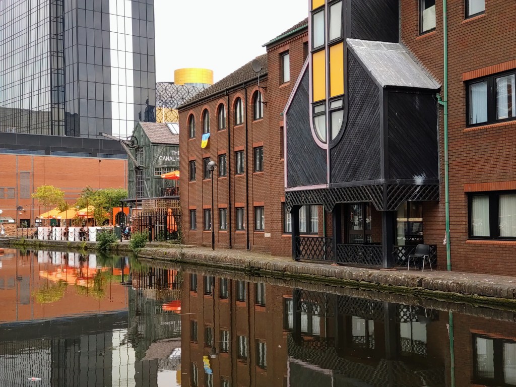
Residential properties near Regency Wharf reflected in Birmingham Canal Navigations, Birmingham
More little things in life
Residential properties near Regency Wharf reflected in Birmingham Canal Navigations, Birmingham
Book review blogger and piano accompanist View more posts

This picture is beautiful and breathtaking. It transports you there.
LikeLiked by 1 person
Thank you, Silvia. I partly took it for the ‘pop’ of warm colours from the sunshades and brick on what was often a grey day, and also for the high-rise buildings contrasting with the low-rise, and the hard materials with the fluid nature of the canal waters.
LikeLiked by 1 person
I can tell that you saw the color scheme and the textures and geometry into consideration and saw the beautiful contrast and harmony. It’s beautiful Chris.
LikeLiked by 1 person
😊
LikeLike